Style as Emotional Framework
Style serves as an emotional signal long before it is identified formally as design. The color, matter, and visual balance in any space serve quietly to frame expectations and influence the feel of an expectant entry or movement through a gathering.
From Visual Taste to Emotional Intention
Personal style is often described in terms of taste, but in gatherings it works more effectively when tied to intention. A restrained palette can suggest calm and focus, while layered textures can create warmth and familiarity. Neither is better in isolation; each supports a different emotional experience.
Consistency Over Complexity
Emotional clarity usually comes from consistency rather than variety. Repeating colors, materials, or shapes across a space helps the eye and mind settle. This repetition creates rhythm and reduces visual noise.
Complexity can be engaging in small doses, but when overused it fragments attention. A consistent visual thread supports ease and presence.
Letting Style Support, Not Lead
Style works best when it supports the gathering rather than becoming its focus. When visual elements demand attention, they can pull people out of interaction and into observation.
Supportive style fades slightly into the background. It is felt more than noticed, shaping experience without dominating it.
Setting and Sense of Place
The ambiance of a gathering is like the soil in a foundation. Whether inside a home, outside in the garden, or in some shared space, the ambiance determines the movement, sound, and energy within the gathering. Well-conceived planning caters to the setting rather than contradicting it.
Responding to the Environment
Every space has inherent qualities: light, scale, acoustics, and texture. Observing these qualities before making decorative choices helps align style with reality.
For example, a bright space may benefit from muted tones that soften it, while a darker setting might welcome reflective or lighter elements to lift the atmosphere.
Indoor and Outdoor Considerations
Indoor and outdoor settings invite different approaches. Indoors, control over light and layout allows for precision. Outdoors, flexibility and responsiveness become more important.
Rather than treating outdoor elements as obstacles, incorporating them into the visual story creates continuity between setting and decoration.
Scale and Proportion
Scale matters as much as color or material. Oversized elements can overwhelm intimate gatherings, while small details may disappear in larger spaces.
Matching the scale of decorative choices to the size and purpose of the gathering helps maintain balance and comfort.
Color Stories and Visual Rhythm
Color is one of the most immediate emotional signals in a space. It influences mood, energy, and perception of warmth or coolness. A color story does not require many colors, but it benefits from clarity and restraint.
Rather than thinking in isolated colors, considering how hues relate to one another creates visual rhythm and cohesion.
Choosing a Dominant Tone
Most successful color stories have a dominant tone that anchors the space. This tone sets the emotional baseline, whether soft, vibrant, earthy, or neutral.
Secondary colors can then support this anchor rather than competing with it. This hierarchy keeps the palette readable.
Using Contrast Intentionally
Contrast adds interest and definition. It can come from light and dark, warm and cool, or muted and saturated tones.
Used sparingly, contrast draws attention to meaningful areas such as tables or entrances. Overused, it can disrupt visual flow.
Color as Temporal Cue
Color can also signal time and pacing. Softer palettes often suit reflective or evening gatherings, while brighter tones may support daytime energy.
Aligning color choices with the time of day helps the gathering feel settled rather than mismatched.
Texture, Material, and Tactile Experience
Texture adds depth where color alone cannot. Materials such as linen, wood, glass, paper, and metal contribute to how a space feels both visually and physically.
Tactile elements ground experience. They invite touch, which subtly increases comfort and presence.
Layering Without Clutter
Layering textures creates richness, but restraint is essential. A few contrasting materials repeated across the space often feel more intentional than many competing surfaces.
This repetition allows texture to be felt without overwhelming the senses.
Natural and Familiar Materials
Materials that feel familiar tend to create ease. Natural fibers, simple ceramics, and untreated surfaces often support calm and warmth.
These materials age well visually and emotionally, making them suitable for gatherings focused on connection rather than display.
Balancing Soft and Hard Elements
Soft textures absorb sound and soften atmosphere, while harder materials provide structure and clarity. Balancing the two helps regulate energy.
Too much softness can feel unfocused, while too much hardness can feel cold. Balance supports comfort.
Lighting as Atmosphere Shaper
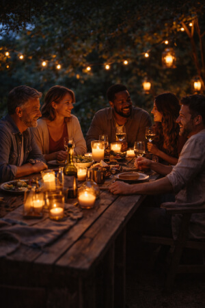
Lighting is one of the most powerful yet understated tools in shaping mood. It influences how people look, how long they stay, and how relaxed they feel.
Rather than thinking only in terms of brightness, lighting works best when considered as a spectrum of intensity and warmth.
Layered Light Sources
Using multiple light sources creates depth and flexibility. Overhead light establishes visibility, while lower sources such as lamps or candles add intimacy.
Layered lighting allows adjustment as the gathering progresses, supporting different phases of energy.
Warmth and Color Temperature
Warm light tends to feel more inviting and forgiving. Cooler light can be useful for clarity but may feel harsh in social settings.
Choosing light temperature deliberately helps align atmosphere with intention.
Letting Shadows Exist
Even lighting everywhere can flatten a space. Allowing shadows creates contrast and visual interest.
Shadows also support intimacy by reducing the sense of exposure, making people feel more at ease.
Small Details and Their Cumulative Effect
Everything works together to create a hedonistic experience-a new trend in interior decoration. Details as such-the trickles of embellishments, the interplay of colors right there on the style line, consciousness of space utilization-begin to chase each other around the memories of the event consumed during sedentism. Such are the times that they leave most things in stark contrast to the design scheme.
The best details are those that out creep everything in the design; some respect for consistency is always nice up front to comfort the eye.
Would that more details lay claim to dominance of his context? Yet, just the perfectionism it is not.
- Colors and materials are consistently used throughout elements
- Favored creature comforts employing less friction
- Repetition making visual rhythm
- Repose allowing for a little back-and-forth
Function reveals a process of working with details to realize a beautifully realized moment.
Editing as a Design Tool
Removing elements can be as powerful as adding them when shaping a gathering. Editing helps clarify intention by reducing visual noise and unnecessary detail. When fewer elements compete for attention, the atmosphere feels calmer and more focused. What is left out often defines mood just as strongly as what remains visible.
Letting Imperfection Remain
Slight irregularities signal authenticity and human presence. Perfect alignment or symmetry is not always necessary for a space to feel considered. Allowing small imperfections introduces warmth and realism, making environments feel lived-in rather than staged. These subtle variations often help people relax and engage more naturally.
Trusting the Overall Feeling
When everything aligns, like all forms of spatial, visual, and sensory elements, the coherence is appealing, even if an individual element is bare from detail. Again, the impression is helpful in escaping from constant adjusting or last-minute changes. Rather than formal, almost endless polishing, such an atmosphere of certitude coaxes the happenings into an easy, relaxed stream.
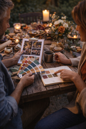
Stationery and Graphic Details
Printed and written elements quietly frame a gathering. Invitations, menus, place cards, and notes set expectations before arrival and guide experience during the event.
These details benefit from clarity and simplicity.
Typography and Tone
Typography is unobtrusive yet plays an important role in flush of a printed piece even before any words. A nice clean typeface is usually associated with serenity, understanding and comfort, while Treatment styles such as the more decorative ones would be associated with elegance and occasion. It is quite relevant to mention that the more the fonts used in the project are made to be in tandem with the overall mood the better such elements are perceived as complimentary instead of consider each of them to be in rivalry with the rest.
Paper and Material Choices
Paper texture and weight influence how stationery feels in the hand and how it is emotionally received. Heavier or textured papers often feel intentional and considered, while lighter options suggest informality. Choosing materials that echo textures used elsewhere in the setting creates visual and tactile continuity.
Handwritten Elements
Handwriting introduces a sense of human presence that printed text cannot replicate. Even small handwritten notes or place cards can shift the tone from formal to personal. These details often leave a strong impression because they signal care, attention, and direct connection to the people gathered.
Table Settings as Shared Focus
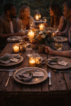
Tables often function as the physical and emotional center of a gathering. They bring people together around shared activity and attention.
Thoughtful table settings support this role without turning the table into a display object.
Function Before Ornament
Comfort and usability come first. Plates, glasses, and seating should support ease rather than demand careful handling.
When function is respected, decorative elements feel supportive rather than intrusive.
Repetition and Restraint
Repeating simple elements across place settings creates cohesion. Small variations can add interest without breaking rhythm.
Restraint keeps the table readable and welcoming.
Personal Touches
Handwritten elements, familiar objects, or subtle references to shared history can add warmth.
These touches matter most when they feel genuine rather than staged.
Style as Quiet Influence
While style, substance, embellishments, and motifs, artfully balance together to define an ambiance that invisibly presides over a certain range and intensity of experience against the participant's will, the perception and legality of such an environment through color, line, air, and material in addition to aesthetics become too pronounced. Furthermore, an appreciation of beauty in arts in style has a meliorating effect on appreciation aspect of things. And As opposed to that, style is more about how an event looks and the lapse of that lens on a specific episode.